

Podcast Addict Redesign
Podcast Addict is one of the most popular podcasts applications available on Android. It is lauded for its numerous functions and settings, allowing users to extensively customize their listening experience. However, the app leaves much to be desired when it comes to an engaging interface and user experience. Therefore, I redesigned the app to improve its UI and bolster its discoverability function for new podcasts based on existing tastes and listening history.
My Role
Research, Writing, UX Design, UI Design
Process
App analysis, Sketching, Wireframing, Prototyping, User testing
Tools
Figma, Adobe Photoshop.
App Analysis & Mapping
First, to determine the specific pain points of the app, I constructed a wireframe flow to visualize how a user can currently discover new content. They can do so by using the search function in the discover section, browsing through the many general categories in the discover section like “Trending,” or finding suggested content in the “Suggestions” section.
However, during their exploration and discovery, the user encounters a few pain points: cluttered and unintuitive UI that makes navigation difficult, confusion finding the discoverability feature on the home page, an unhelpful search function with few filters, and dead ends in the user flow—particularly when cancelling a search. The most significant user pain point is the “Suggestions” option. In the discover section, it appears at the end of a vertical scroll, making it likely that users will miss this important option. If a user does find this option, they are given few suggestions that are not delineated or tailored to the listener in any meaningful way.
People Problem
Despite its popularity, Podcast Addict pales in comparison to other popular podcast apps like Spotify and Apple Podcasts because of its poor design and unclear built—as seen with its confusing and sub-par discoverability feature. These issues constitute the two major pain points users of the app note in their reviews on Android’s Play Store. They describe the UI as being cluttered and unintuitive, and the discoverability feature being difficult to find and use—stating that it was easy to get lost in the app, that the search function was not user-friendly, and the categories found in the discoverability feature were “unattractive.”
Hence, the UI and discoverability feature of Podcast Addict are being re-designed to provide a more streamlined and engaging podcast experience, and to help users effectively discover new content based on their existing tastes and listening history. Ultimately, these changes would improve user engagement and retention, and allow Podcast Addict to become one of the top podcasts apps available on Android.
User Story
As a user, I want to easily discover new podcasts suited to my tastes so I can listen to new shows I know I will like and add them to my podcast library.
Competitive Analysis:
Upon researching other popular podcast platforms, I found that tiled grid layouts were a common way to showcase podcasts and drive user engagement. In this format, the podcasts were able to chunk information and employ few type styles while maintaining distinct hierarchy. Overall, podcasts with structured and minimalist designs were found to be intuitive and easy to use. For discovery, all podcasts, except Stitcher, featured bottom navigation with tabs dedicated to discovery and/or search. Aside from featuring general categories and popular and trending content, some platforms recommend categories and individual podcasts based on users’ listening history in sections titled “You Might Like” and “Top Picks For You.” Therefore, both interface features and discovery methods were the main features I identified as critical for my redesign.

Design Challenge
How might we facilitate an engaging app experience and improve the discovery feature?
User Flow
I devised an ideal user flow based on my analysis of the pain points present in the original app. This user flow improves navigation and adds options for podcast discovery.
Low-Fidelity Wireframes
I began sketching ideas to figure out how to compose the basic content and visuals of each screen. This phase helped to map out the interface, its screens, and basic information architecture.

Medium-Fidelity Wireframes
Once I was satisfied with the compositions I explored during low-fidelity sketching, I moved into medium-fidelity wireframing. During this phase, I organized information and placeholder visuals, taking care to be consistent with type, sizing, and spacing and creating a logical flow of screens.
Usability Testing
After completing medium-fidelity wireframing, I conducted a usability test with 3 participants to uncover pain points in my designs and determine whether I had made the app more engaging, easy to navigate, and improved discoverability.
Hypothesis
Users want podcasts suggestions and curated lists based on their existing preferences and listening history because it makes it easier for them to find something they like and want to subscribe to.
What I Wanted To Learn
Have the user pain points been resolved?
Has the UI been improved to provide an easy, intuitive, and fun experience?
Does the prototype help users discover new podcasts based on their preferences?
Does the prototype create new pain points?
Testing Questions:
Do you think the prototype is effective in helping users find a podcast suited to their tastes?
Do you think the information architecture and UI is designed in a clear, logical, and easy to understand way?
What do you think about the prototype’s navigation?
What would you improve?
Testing Results
1. A user said suggested that tags with specific categories or themes in the filters menu would make it easier to find podcasts they’d like.
2. Users wanted podcast titles in the “search”, “discover”, and “for you” sections to be a larger font size than the producers’ names.
3. Users liked the mid-fidelity UI because it was clean, structured, and had consistent margins and spacing.
4. Users wanted the ability to delete past searches as this is a common convention in other similar apps.
5. A user noted that the filters menu sliding up felt out of place because no similar components existed. They suggested a page for filters.
6. Users felt the prototype was intuitive and easy to navigate.
7. A user wanted profiles that could connect them to friends and communities on the app, which would help in finding relevant podcasts.
8. Users appreciated the filters section and the options in it, and thought it was a good way to find shows they would enjoy.
9. Users felt it was easy to discover new podcasts and to find podcasts specific to their tastes.
10. Users felt the discover page was logical and offered a lot of browsing possibilities.
Design Library

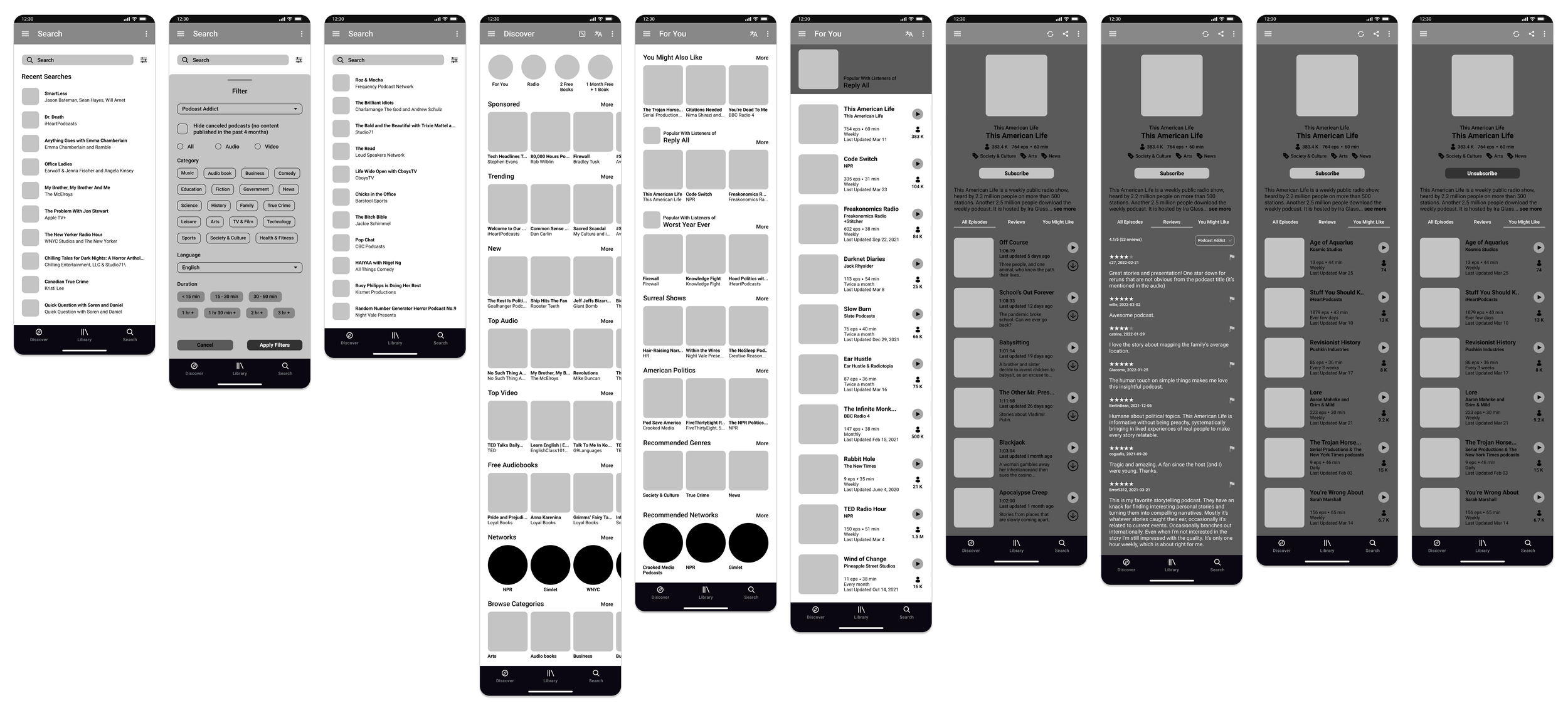
Final Prototype
In this last stage, I used the insights gained from testing to iterate on my wireframes and bring them to high-fidelity. I focused on designing the user interface while keeping the spirit of the original app—only making necessary changes that improved the visual design and aided in usability. Ultimately, I kept the design simple, minimal, and easy to use.

Learnings
During the process of redesigning Podcast Addict, I learned how to employ research, analysis, and visual design to improve an existing app while respecting the spirit of the original. I was able to explore my visual design skills in subtle ways, making small but significant changes that improved the overall design and usability of the app. I remained steadfast in maintaining consistency by using grids, alignment, spacing, stroke weight, and more. Ultimately, this case study allowed me to experience the process of iterating on an existing digital artifact—no doubt, the case for all UX designers entering companies with established digital products.
Next Steps
My next steps for this redesign are to establish user profiles and an onboarding process that focuses on gaging user’s tastes. User profiles that connect listeners to friends and relevant communities would aid users in organically discovering new content, and further improve user engagement and retention with the app. An onboarding experience that collects information on users’ existing likes, such as favorite media personalities and shows, would improve the app’s algorithm, and allow it to suggest and curate content more suited to individual needs.
Try the Prototype!